

In May, Google unveiled its latest design language called Material 3 Expressive, and since then, a series of updates have been gradually introduced to various Google applications on Android devices. This article details the prominent features and enhancements available now, as well as those expected soon.
Rolling Out Updates
Google Calendar Redesign
Google Calendar has embraced the Material 3 Expressive update with visually pleasing rounded containers for time slots, enhancing the Days, Weeks, and Months views. The previously subtle lines have been replaced by solid background layers showcasing the primary Dynamic Color, creating a cleaner look.
Google Contacts Revamp
The redesign streamlines Google Contacts by placing information into well-defined containers. The bottom navigation bar has been shortened, providing a more intuitive user interface while enhancing the overall visual experience with color adjustments in the background.
Digital Wellbeing Updates
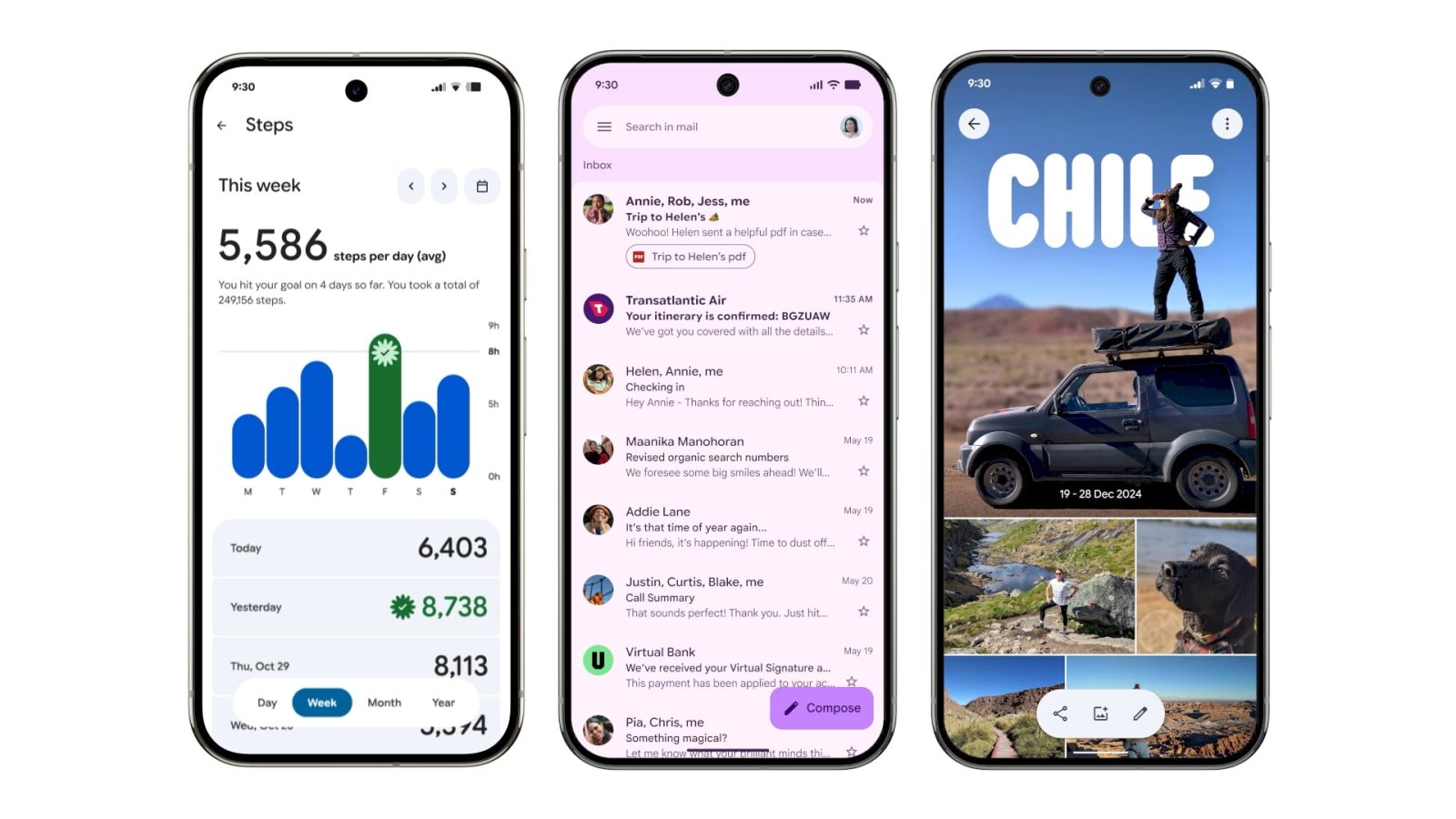
The main interface of the Digital Wellbeing app now features a Material 3 Expressive theme. This includes the addition of thicker containers for graphs, specifically the donut chart, which is part of version 1.30.x currently rolling out in beta.
Google Photos Enhancements
In Google Photos, a new backup indicator replaces the former title on startup, transitioning from the app logo to “Backup complete.” Users can enjoy an engaging experience by pulling down to refresh, revealing animated Material 3 shapes and a progress tracker during backup operations.
Google One UI Adjustments
The Google One app features a more compact bottom navigation bar and emphasizes its cards and settings in more prominent containers. The overall app layout has been simplified by removing infographics for a denser user experience.
Comprehensive Overhaul of Phone by Google
Phone by Google has undergone a comprehensive redesign, restructuring the bottom navigation from four tabs to three, consolidating the favorites and recent calls into a “Home” tab. The touch targets for incoming and in-call screens have been enlarged, offering greater ease of interaction. Users will now find contacts organized in a navigation drawer, enhancing accessibility.
Google Keep’s New Features
Google Keep has integrated the Material 3 Expressive search app bar, repositioning menu options outside the search area. The notes page has also seen visible updates, with all buttons neatly organized within containers, improving usability and design coherence.
Improvements in Google Wallet
The Google Wallet app has transitioned from merely displaying “Wallet” to incorporating the app logo in the top-left corner. Below the carousel, the list of passes now utilizes thicker cards, while the Recent Activity page has also been updated with containers for better organization.
Google Messages Transformation
With the new design, Google Messages now features rounded containers for both conversation lists and message threads. The ‘plus’ menu has been revamped, presenting options in pill-shaped buttons and reflects Material 3 Expressive principles in other sections like chat creation and settings.
Gmail Interface Refinements
In Gmail, the email list and message display is encapsulated in a container format. The app also showcases a dynamic pill-shaped animation when users perform swipe gestures, enhancing the overall interaction experience.
Newly Launched Features
First to Implement Material 3 Expressive
Google Meet has emerged as the pioneer app to wholly adopt the Material 3 Expressive redesign. The homepage displays each call within tall cards, adhering to M3E’s emphasis on container usage. During calls, the interface features oversized buttons for voice and video, which while appearing exaggerated, create a bold impression.
Google’s Material 3 Expressive Design Language
In recent months, Google has introduced its innovative Material 3 Expressive design language across various applications. This new aesthetic approach aims to enhance user experience by offering a more engaging and visually appealing interface. Whether you are using Google Calendar, Photos, or Messages, the updates promise a refined look and improved usability.
Enhanced Visuals in Google Calendar
The redesign of Google Calendar reflects an emphasis on clarity and organization. New rounded containers for time slots replace previous faint lines, making it easier for users to navigate through different views such as Day, Week, and Month. The enriched background layer incorporates Google’s dynamic color palette, resulting in an aesthetically pleasing environment for managing schedules.
Simplified Interface for Google Contacts
Google Contacts has also undergone a transformation with the introduction of the Material 3 design. The redesign emphasizes a cleaner, more straightforward layout. The newly shortened bottom navigation bar enhances usability, while color adjustments improve the overall visual comfort of the app’s background. These changes work together to provide a more cohesive user experience.
Digital Wellbeing Gets a Makeover
As part of its commitment to promoting user health, Google has revamped its Digital Wellbeing application. The main page now features updated components in the Material 3 Expressive style, including thicker donut graphs that provide clear visual feedback. This update aims to facilitate users in tracking and managing their digital habits more efficiently and effectively.
Innovative Features in Google Photos
Google Photos now showcases a fresh backup indicator at the app’s top, transitioning from a logo to an animated “Backup complete” message. Users can experience interactive visual elements due to the pull-to-refresh feature, which showcases cycling shapes that represent stored data. This adds a dynamic component to what was previously a static interface, engaging users in their backups like never before.
Streamlined Navigation in Google Messages
In Google Messages, the redesign focuses on the clarity of conversation threads, now presented in rounded containers that enhance readability. The revamped ‘plus’ menu introduces pill-shaped buttons for a more modern feel, alongside other redesigns affecting search and settings sections. This update fosters a smoother experience when managing communications, reflecting a contemporary touch in design.
Exciting Updates Across Other Google Apps
The Material 3 Expressive updates extend to several other apps, including Google One, Phone, Keep, and Wallet. Each app integrates the new design’s color scheme and layout principles, showcasing Google’s commitment to a cohesive user experience across its suite of applications. These updates not only modernize the look but also enhance the functionality of the apps, making them more intuitive and user-friendly.
Conclusion: Embracing Change in App Design
With the rollout of Material 3 Expressive, Google is setting a new standard in application design that prioritizes user experience, aesthetics, and functionality. As these updates continue to be integrated into various apps, users can expect a brighter, cleaner, and more engaging digital landscape that enhances productivity and enjoyment.